Week 06 Optional Exercises (Solutions)
PPOL 6803
02/18/2026
Feel free to try the exercises below at your leisure. Solutions will be posted later in the week!
Geospatial
- Using the Texas unemployment figures here,
create a choropleth of Texas counties in
ggplot2where darker filled counties represent higher unemployment rates. (Texas county shapefile downloadable from the Census Bureau here.) (If you want to challenge yourself, try also replicating this map inleaflet!)
library(dplyr)
library(sf)
library(ggplot2)

tx_unemploy <- read.csv('https://raw.githubusercontent.com/apodkul/ppol6803_03/main/Data/tx_county_data.csv')

tx_shape <- sf::read_sf('cb_2018_us_county_20m/cb_2018_us_county_20m.shp') %>%
  filter(STATEFP == 48) %>% # Subset to Texas
  mutate(FIPS_ST_CN = stringr::str_c(STATEFP, COUNTYFP) %>% as.numeric())

tx_shape %>%
  left_join(tx_unemploy, by = 'FIPS_ST_CN') %>%
  ggplot() +
  geom_sf(aes(fill = Unemployment)) +
  theme_minimal() +
  coord_sf() +
  scale_fill_gradient(low = 'white',
                      high = 'black') +
  ggtitle("Texas Unemployment by County")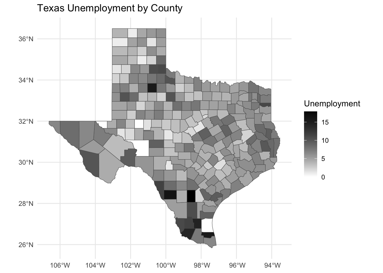
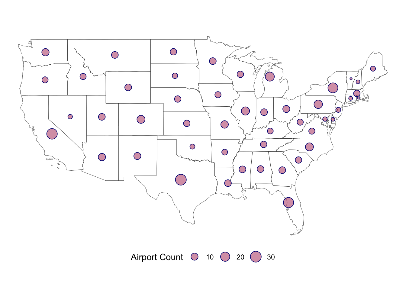
- Create a bubble map of U.S.
states (excluding AK and HI) with a point at each state’s centroid
sized proportionally to the number
of airports in each state. (Hint:
sf::st_centroidorrgeos::gCentroidmight be helpful here.)
library(dplyr)
library(sf)
library(ggplot2)

us_airport <- read.csv('https://raw.githubusercontent.com/apodkul/ppol6803_03/main/Data/airport_list.csv') %>%
  group_by(State) %>%
  dplyr::summarize(Count = n()) %>%
  filter(!(State %in% c("Alaska", "Hawaii", "Dist. Of Columbia")))

us_shape <- sf::read_sf('cb_2018_us_state_20m/cb_2018_us_state_20m.shp') %>%
  filter(!(STUSPS %in% c("AK", "DC", "HI", 'PR'))) # Remove AK, HI, DC and PR

ggplot(us_shape) +
  geom_sf(fill = 'white') +
  coord_sf() +
  geom_sf(data = sf::st_centroid(us_shape) %>%
               left_join(us_airport, by = c("NAME" = "State")),
          mapping = aes(size = Count),
          shape = 21, color = 'navy',
          fill = alpha('maroon', .5)) +
  theme_void() +
  scale_size_continuous('Airport Count') +
  theme(legend.position = 'bottom')